Shot lists, mood boards, and creative direction. How to plan one photo shoot that fuels 12 months of marketing.
Why One Planned Brand Shoot Beats Twelve Scrambles
Most businesses treat photography reactively. The website needs a new hero image, so someone grabs a phone. The ad campaign needs visuals, so someone buys a stock photo that three competitors are also running. A trade show is coming up, so a photographer gets booked for two hours with no brief. A year later the brand’s visual record is a junk drawer: mixed lighting, mixed quality, mixed eras of the logo, and nothing that actually works in the formats marketing needs.
The alternative is to treat brand photography the way you’d treat any other production asset: plan one substantial shoot per year, brief it against everything the business will publish over the next twelve months, and walk away with a library instead of a handful of pictures. One well-planned day — or two, for businesses with multiple locations or seasonal work — can realistically cover the website, the Google Business Profile, every social channel, the ad account, email headers, proposals, and recruitment pages.
The difference isn’t the photographer’s talent. It’s the brief. A photographer pointed at “get some shots of the team” produces some shots of the team. A photographer handed a shot list that says “horizontal hero of the lead technician at the panel, subject on the left third, clean copy space on the right, for the homepage” produces an asset that drops straight into a layout. Almost everything in this guide is about closing the gap between those two briefs.
The payoff compounds. When every photo was captured under the same direction, the brand looks coherent everywhere it appears — and coherence is what makes a small company read as an established one. That perceived consistency is something stock photography can’t fake, which is where the economics conversation starts.
Stock vs Custom Photography: The Real Economics
Stock photography looks cheap and custom photography looks expensive, and both impressions are misleading once you count usage instead of invoices.
Stock’s real costs show up downstream. The obvious one is sameness: popular stock images circulate widely, and prospects do notice when your “team” also appears on a dentist’s site two suburbs over. The subtler one is fit. Stock almost never matches your actual premises, equipment, uniforms, or customers, so every page built on it quietly tells visitors “this is a placeholder business.” For local service companies in particular — where the buying decision is substantially “do I trust these specific people to show up at my house” — generic imagery works against the core conversion argument. Stock also can’t cover the assets that matter most: your storefront, your fleet, your founder, your before-and-afters, your reviews come to life.
Custom’s economics improve with planning. A photographer’s day rate feels steep when it produces six photos; it’s trivial when it produces a hundred and fifty usable frames that feed twelve months of publishing. The unit cost of a custom image is the shoot cost divided by the number of placements it serves over its lifespan — and that denominator is entirely under your control. A planned shoot with a usage-mapped shot list might put the cost per deployed image below what licensed stock would have run, with none of stock’s trust penalty.
The honest hybrid: stock still earns a place for conceptual filler — abstract textures, illustrative metaphors in blog headers, generic objects nobody associates with your team. The rule worth adopting is simple: anything depicting your people, your place, your work, or your customers must be real. Anything purely decorative can be bought. Most businesses have this exactly backwards.
Usage Mapping: Plan Every Photo’s Destination Before the Shoot
Usage mapping is the discipline that separates a shoot that yields a year of content from a shoot that yields a nice folder. Before anyone touches a camera, inventory every place a photo will live over the next twelve months, then work backwards into requirements.
Start with the website. Walk every page template and list its slots: homepage hero, service page headers, about page portraits, team grid, location pages, case study imagery, blog headers, the contact page. For each slot, note orientation, rough aspect ratio, whether text will overlay the image, and whether the image needs a calm area for that text. A homepage hero that takes a headline needs a subject pushed to one side and a quiet background on the other — that’s a direction note, not a Photoshop fix.
Then social, by channel. Square and vertical crops for feed posts, tall 9:16 frames for stories and reels covers, wide banners for LinkedIn and YouTube, and a steady supply of candid, less-polished frames — behind-the-scenes texture performs differently from hero polish, and you want both. If video is on the plan, capture short clips on the same day; the marginal cost is nearly zero.
Then ads, which have the strictest needs: multiple aspect ratios of the same concept (1:1, 4:5, 1.91:1 at minimum), variants with and without people, clean backgrounds that survive compression, and enough distinct concepts to rotate creative when fatigue sets in. Then everything else — email headers, Google Business Profile, proposal covers, signage, recruitment.
The output of this exercise is a spreadsheet: one row per placement, columns for orientation, crop, overlay needs, subject, and priority. Sorted and deduplicated, it becomes the spine of your shot list — and it guarantees no one ends the day saying “we forgot the vertical crops.”
Building the Shot List: Categories Every Brand Needs
With the usage map done, translate placements into shots. Most businesses need the same six categories, weighted differently by industry.
People. Individual portraits of everyone client-facing, in consistent lighting against consistent backgrounds, plus genuine candids of the team working together. Shoot portraits in two crops each — tight for avatars and bylines, wider for team pages — and shoot more expressions than feels necessary. The slightly-laughing frame outperforms the formal one almost everywhere except the proposal cover.
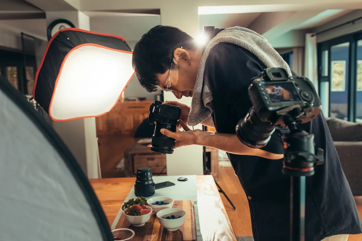
Work in progress. Hands doing the actual job: the technician at the panel, the designer at the screen, the kitchen mid-service. These are your most versatile assets because they prove competence without a single word of copy. Brief them as real work, not pantomime — viewers can tell.
Place. Exteriors and interiors of your premises, signage, vehicles, equipment. Shoot the exterior at the day’s best light, not whenever the schedule lands there.
Product or outcome. What the customer actually buys: finished installs, completed projects, plated dishes, delivered goods. If before-and-after is part of your sales story, plan the “before” captures weeks ahead — they can’t be staged later.
Customers. The hardest and most valuable category: real clients interacting with your team or your work, with signed releases. Even two or three authentic customer frames will outwork a folder of staged alternatives.
Detail and texture. Close-ups of materials, tools, branded items, environmental details. These are the unsung workhorses — backgrounds for quote graphics, email headers, and section breaks all year.
For each shot, the list should carry one line of intent: subject, orientation, crop, the placement it serves, and any overlay note. A realistic full-day shoot covers forty to sixty planned shots plus candids; prioritize ruthlessly so the must-haves are captured before lunch.
Mood Boards and Creative Direction That Photographers Can Use
A shot list says what to capture; creative direction says how it should feel. Skip this step and you’ll get technically fine photos in the photographer’s default style, which may or may not be your brand’s.
The working tool is a mood board: a single page of ten to twenty reference images that demonstrate the look you’re after. Pull references from brands you admire — they don’t need to be in your industry — and from your own past photos that worked. The board should answer the questions a photographer will actually ask: How bright and airy versus moody and contrasty? Natural light or controlled? Candid energy or composed stillness? How much negative space? Warm tones or cool? Do we shoot wide and environmental, or tight and intimate?
Just as useful is the anti-board: a few examples of what to avoid. “No forced-perspective handshakes, no fluorescent overhead lighting, no cluttered backgrounds” prevents more bad frames than any amount of positive direction.
Tie the direction to your existing identity. If your brand palette is navy and warm grey, wardrobe and styling notes should keep those tones in frame and keep clashing colours out, because photos that harmonize with the palette drop into layouts without fighting the design. If your brand voice is plainspoken and warm, the photography should be too — real expressions, real environments, minimal retouching. Visual identity and photography are the same argument made in different media, and audiences register the mismatch even when they can’t name it.
Share the mood board, anti-board, and shot list with the photographer before booking, not on the morning of the shoot. Good photographers will sharpen your plan, flag what’s unrealistic in the time available, and often suggest shots you didn’t know to ask for. That conversation is free; reshoots aren’t.
Planning the Shoot Day: Logistics That Protect the Output
Shoot days fail on logistics more often than on creativity, and every failure is preventable with a schedule.
Build a run-of-show that sequences shots by location and lighting, not by importance. Group everything in the workshop together, everything outdoors together, and schedule outdoor work for the most flattering light you can get — typically earlier or later in the day rather than harsh midday. Batch all portraits into one block so the lighting setup happens once and stays consistent across every team member, including the people who join the company in month eight; note the setup so it can be reproduced for new-hire portraits later.
Assign a director who is not the photographer. The photographer’s job is making frames; someone from your side owns the shot list, checks items off as they’re captured, watches for brand problems in frame — outdated logos, competitor products, messy corners, a safety violation that would be embarrassing in an ad — and makes the call when the schedule slips. Without this person, the day drifts toward whatever is easiest to shoot.
Prepare the humans. Tell the team a week ahead what to wear (brand-adjacent solids, no busy patterns, no giant third-party logos), confirm who is comfortable on camera, and have releases ready for anyone who appears — staff and customers alike. Prepare the space: the deep clean happens the day before, props and products staged, vehicles washed.
Finally, settle licensing before the deposit. You want broad, perpetual commercial usage across web, social, and paid advertising — paid usage is the term photographers most often price separately, and discovering that gap when the ad campaign launches is an expensive way to learn it. Get the terms in writing and keep them with the assets.
Shoot for the Crop: Formats, Copy Space, and Ad Variants
A photo that only works at one aspect ratio is a single-use asset. A photo composed with cropping in mind is five assets. The difference is decided in the viewfinder, so it belongs in the brief.
The practical rules. Shoot looser than feels natural: extra room around the subject lets one frame become a wide website hero, a square feed post, and a tall story crop, while a tightly composed frame locks you into one shape forever. For every key concept, capture deliberate horizontal and vertical versions rather than hoping a crop will rescue the wrong orientation — a composition built for 16:9 rarely survives 9:16 with its meaning intact. Keep subjects off-centre for hero shots so headlines and buttons have somewhere to live, and ask for some frames with large, clean negative space on each side; designers will fight over those.
For ads specifically, think in variants at capture time. The same scene shot with the subject left, subject right, and subject centred gives the ad account three layouts to test from one setup. A version with a person and a version without lets you test the well-documented difference in how audiences respond to faces. Two or three genuinely distinct concepts, each captured in the full set of ratios, is enough rotation to keep a small ad account fresh for months.
Two technical notes worth writing into the agreement: delivery at full resolution, not just web-sized exports, so print and large-format uses stay open; and at least a light colour-grading pass applied consistently across the whole set, so images shot in different rooms still sit next to each other comfortably on one page. Consistency of grade is half of what makes a library feel like a brand.
Organizing the Library So It Lasts Twelve Months
The shoot ends with a delivery of a few hundred frames, and this is where most of the value is traditionally lost — the folder gets skimmed once, six photos get used immediately, and the rest are forgotten. Three habits prevent that.
First, do a real selects pass within a week, while context is fresh. Rate everything, kill the duds, and tag the keepers by category (people, work, place, product, detail), orientation, and intended placement from your usage map. Rename files descriptively — who, what, where — because nobody is searching for IMG_4got the right photo in 4087 next March. A shared, organized library beats a sophisticated tool nobody opens; a well-structured cloud folder is genuinely enough for most teams.
Second, ration deliberately. The temptation after a shoot is to flood every channel with the best material in week one. Resist it. Map the library against the publishing calendar: heroes and page imagery deploy immediately, the strongest social frames spread across the year at a steady cadence, seasonal shots wait for their season, and a reserve stays untouched for the campaigns and announcements you can’t predict yet. A hundred and fifty usable frames is roughly three per week for a year — that’s the math that makes one shoot fund twelve months.
Third, plan the refresh before you need it. Photos age: people leave, uniforms change, premises get renovated, and a team page showing two departed employees quietly erodes trust. Put a twelve-month review on the calendar, book the next annual shoot before the library runs dry, and capture interim gaps — new hires, new equipment, completed flagship projects — with small top-up sessions under the same creative direction. At SearchPod we treat the annual brand shoot as marketing infrastructure, the same way we treat the website or the ad account: planned, budgeted, and quietly working every single week. One day of production, a year of content — but only if the plan comes first.
Want help implementing this?
Get a free proposal for your branding setup. We’ll show you exactly where the opportunities are.
Get Free ProposalRelated Articles