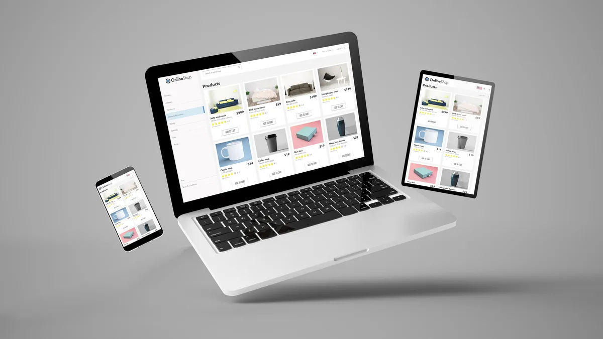
Modern responsive design in 2026: container queries, fluid typography, and CSS layout patterns that adapt to any screen without breakpoint juggling.
Why Breakpoints Stopped Being the Answer
For most of the last decade, “responsive design” meant one technique: media queries. You picked two or three screen widths — phone, tablet, desktop — and wrote rules that rearranged the page when the browser crossed each line. It worked, mostly, and it became the thing business owners learned to ask for: “Is the site responsive?” Yes. Checkbox ticked.
The problem is that the checkbox never described reality. There is no such thing as “the phone width” anymore. A small phone, a large phone, a foldable half-open, a tablet in split-screen, a browser window snapped to half a monitor — your visitors arrive at every width between roughly three hundred and three thousand pixels, and they resize, rotate, and zoom while they’re there. A design built around three hard-coded widths is correct at exactly three widths and an approximation everywhere else. The seams show up as squashed cards just below a breakpoint, stretched text just above one, and a layout that visibly jumps as the window crosses the line.
Modern responsive practice flips the model. Instead of telling the layout what to do at specific widths, you describe how components should behave — how small text is allowed to get, how narrow a card can be before it wraps — and let the browser work out the rest continuously. Breakpoints still exist, but they’ve been demoted from the whole strategy to an occasional escape hatch. That shift is what this article unpacks, and it matters commercially: the sites that feel effortless on every device are the ones built this way.
Container Queries: Components That Adapt to Their Space
The single biggest change in responsive CSS in years is the container query, now supported in every major browser. To understand why developers were excited about it for a decade before it shipped, you need to see the flaw it fixes.
A media query can only ask one question: how wide is the whole screen? But a component doesn’t live on the whole screen — it lives in a column, a sidebar, a grid cell. Imagine a product card that shows an image beside its text when there’s room, and stacks them when there isn’t. With media queries, that card has to guess its own width from the screen width: “if the screen is this wide, I’m probably in a three-column grid, so I’m probably narrow.” The moment the card gets reused somewhere else — a wide article body, a narrow sidebar — every guess is wrong, and someone has to write new rules for each location.
A container query lets the card ask the question that actually matters: how wide is the box I’m sitting in? If it has more than a certain amount of room, lay out side by side; if less, stack. The card now behaves correctly everywhere it’s placed, automatically, with one set of rules.
For a business owner the payoff is indirect but real: components become genuinely reusable, which means new pages and landing-page variants get built faster and break less. When your agency says they’re building a component library, container queries are a large part of what makes that library actually hold up across a whole site.
Fluid Typography and Spacing
Open an older responsive site and watch the headline as you slowly narrow the browser window. Nothing, nothing, nothing — then a sudden jump from a large size to a small one as you cross the breakpoint. The text was too big at one width and too small a pixel later, and every size in between was a compromise.
Modern CSS replaces those jumps with a function called clamp, which lets a developer express a size as three values: a minimum it never shrinks below, a maximum it never grows beyond, and a preferred value in between that scales smoothly with the viewport. A headline might be told, in effect: never smaller than thirty-two pixels, never larger than fifty-six, and in between, grow proportionally with the screen. The result is type that is always appropriately sized at every width — with no breakpoints involved at all.
The same idea applies to spacing. The padding around a section, the gap between cards, the margins of a hero — all of these read better when they breathe with the screen rather than snapping between fixed values. A well-built fluid scale defines a handful of sizes once, and the entire site inherits continuous, proportional sizing from them.
Two cautions from practice. First, the minimum matters more than the maximum: body text below sixteen pixels on small phones is a readability failure, so the floor needs to be chosen deliberately. Second, fluid sizing must respect the user’s own font-size settings — get that wrong and the site fights visitors who have turned their text up, which is a quiet way to lose older customers.
Intrinsic Layout: Grids That Figure Themselves Out
The third pillar is letting layout respond to content, not just to screens — what the CSS community calls intrinsic design.
The old way to build a card grid was prescriptive: four columns on desktop, two on tablet, one on phone, each switch hard-coded at a breakpoint. The modern way is to state a constraint and let the browser solve it: make each card at least, say, two hundred and eighty pixels wide, and fit as many columns as the available space allows. CSS Grid can express that in a single rule. On a wide monitor you might get five columns; on a narrow phone, one; at every width in between, the grid reflows by itself — including widths the designer never explicitly considered, which is most of them. Flexbox offers the same philosophy for rows of items that should wrap naturally when they run out of room, like a set of filter tags or a navigation bar.
This approach has a second virtue that breakpoint grids lack: it responds to content changes, not just screen changes. Add a ninth service to an eight-service grid and the layout absorbs it. Translate the site into German, where every word is longer, and buttons grow to fit instead of truncating. Let a client write a longer card title than the designer planned for — it happens within the first month, always — and nothing overflows or clips.
Newer additions to CSS round this out: viewport units that account for mobile browser bars sliding in and out, and gap-based spacing that eliminates the old margin hacks. None of this is exotic anymore. It’s simply how layout should be written in 2026, and it’s worth asking whether your next build is being written this way.
The Device Reality: Touch, Pointers, and In-Between Screens
Responsiveness was never only about width — it’s about input, and this is where many otherwise good sites quietly leak conversions.
Start with touch targets. A fingertip is a blunt instrument, and the established guidance from both major mobile platforms puts the minimum comfortable tap area at roughly forty-four to forty-eight pixels square. The most common offenders are exactly the elements that make you money: tiny phone-number links in headers, cramped form fields, close buttons on popups. Every mis-tap is friction, and friction on the contact path is lost revenue. Spacing between targets matters as much as size — two large buttons touching each other still produce wrong taps.
Next, stop equating screen size with input method. A tablet with a keyboard is a small desktop; a touchscreen laptop is sometimes a big phone. CSS can ask the browser directly whether the primary input is coarse like a finger or fine like a cursor, and whether the device can hover at all — and good builds use those answers rather than guessing from width. The classic failure here is hover-dependent design: navigation menus or product details that only appear on mouse-over simply don’t exist for touch users. Anything revealed on hover needs a tap-friendly equivalent.
Finally, respect the in-between devices. Foldables present as two different sizes depending on posture. Split-screen multitasking routinely hands your site a phone-width viewport on a tablet-class device. A design built from fluid, intrinsic principles handles all of this without special cases — which is precisely the argument for building that way.
Responsive Images: The Heaviest Thing on Your Page
Images are usually the heaviest assets a page ships, so responsive imagery is where design discipline turns directly into speed — and speed, as anyone who has watched mobile bounce rates knows, turns into revenue.
The core technique is serving different image files to different contexts. The same hero photo might exist in half a dozen widths, and the browser — told what sizes are available and how large the image will render — picks the smallest file that will look sharp on the visitor’s screen. A phone on a cellular connection downloads a few hundred kilobytes instead of the multi-megabyte original destined for a large monitor. Modern formats such as WebP and AVIF compress the same visual quality into dramatically smaller files than old JPEGs, and the responsive image machinery lets each browser take the best format it supports.
Beyond file size, three practices separate professional builds from amateur ones. First, every image gets explicit dimensions so the browser reserves its space before the file arrives — this prevents the maddening page-shifting-under-your-finger effect, which Google measures as Cumulative Layout Shift and factors into rankings. Second, images below the fold load lazily, while the main hero image loads with high priority. Third, art direction: sometimes a smaller screen shouldn’t get a shrunken version of the wide image but a different crop entirely, because the detail that mattered is illegible at phone width.
The good news is that modern frameworks automate most of this — generating size variants, converting formats, lazy-loading, reserving space. The bad news is that plenty of sites still ship one giant image to everyone. It’s one of the first things worth auditing, because it’s often the cheapest large speed win available.
Where Responsive Design Meets Accessibility
Responsive design and accessibility are usually treated as separate checklists, but in practice they overlap so heavily that doing one properly gets you much of the other.
Consider zoom. Accessibility guidelines expect content to reflow at four hundred percent zoom without horizontal scrolling. Here’s the part most people miss: a desktop page zoomed to four hundred percent is, from the browser’s point of view, a narrow viewport. The mechanism that handles it is the same fluid, reflowing layout that handles a phone. A genuinely responsive site meets the reflow requirement for low-vision users essentially for free; a brittle breakpoint site usually fails it. The same logic applies to font-size preferences: layouts built on flexible units accommodate enlarged text gracefully, while pixel-locked layouts clip and overlap.
Touch target sizing is likewise both a usability and an accessibility requirement — the same generous tap areas that prevent mis-taps for everyone make a site operable for people with motor impairments. Orientation is another overlap: some wheelchair users mount devices in a fixed orientation, so a site that only works in portrait is an accessibility failure, not an inconvenience. And CSS can now detect when a visitor has asked their operating system to reduce motion, letting the site tone down animations for people with vestibular disorders.
The practical takeaway: when evaluating a build or an agency, ask how the site behaves at four hundred percent zoom and with system text size turned up. The answer tells you whether responsiveness was implemented as a philosophy or as three breakpoints — and it matters for compliance, since accessibility requirements in both Canada and the US touch exactly these behaviours.
How to Actually Test Responsive Work
Most responsive testing is theatre: the developer drags the browser narrow, glances at three preset device sizes in the developer tools, and calls it done. Real testing is broader, and you don’t need to be technical to run a useful version of it yourself.
Start with the resize test. Open your site on a desktop and drag the window slowly from full width down to as narrow as it will go. Watch continuously, not at checkpoints. Anything that overlaps, clips, jumps awkwardly, or produces a horizontal scrollbar at any width is a defect — modern sites should reflow smoothly through the entire range, because visitors live at every width, not just the famous ones.
Then test the conditions simulators miss. Real devices reveal what emulators can’t: how the layout shifts when the mobile browser’s address bar collapses, how forms behave when the on-screen keyboard takes half the viewport, whether tap targets feel comfortable under an actual thumb. Test landscape orientation. Test at four hundred percent zoom on desktop and with the system font size increased on a phone. Fill your own forms on a phone, top to bottom. If you sell to the public, borrow the cheapest, oldest Android phone you can find — that’s closer to a meaningful slice of your audience than the newest device in the office.
Finally, focus the effort where money flows. The pages that deserve exhaustive device testing are the contact page, the quote form, the checkout, and the landing pages your ads point at. A cosmetic wrinkle on the about page costs you nothing; a form that misbehaves under a phone keyboard costs you leads every day, invisibly. At SearchPod we treat the mobile conversion path as its own test plan for exactly this reason.
What This Means for Your Next Build
If you’re commissioning a site or auditing one, you don’t need to write CSS to apply any of this. You need the right questions.
Ask whether the build uses fluid typography and spacing or fixed sizes at breakpoints — and watch the resize test answer for itself. Ask whether components adapt to their containers, so the card that works on the homepage also works in the sidebar without a rebuild. Ask how images are sized, formatted, and lazy-loaded, because that’s where the speed budget lives. Ask what the minimum touch target size is on the contact path. Ask how the site behaves at four hundred percent zoom. None of these questions require expertise to ask, and the quality of the answers will tell you quickly whether you’re dealing with practitioners or template installers.
The deeper point is that “responsive” stopped being a feature you add and became a property of well-built sites — the natural result of fluid sizing, intrinsic layout, container-aware components, disciplined imagery, and input-aware interaction design. Sites built this way don’t have a mobile version and a desktop version; they have one design that holds its shape across every screen that exists now and every screen that doesn’t exist yet. Next year’s devices will hand your site viewport sizes nobody planned for — and a constraint-based design will simply absorb them, while a breakpoint design will need another round of paid fixes.
That’s the honest business case. Beyond-breakpoints design costs a little more attention up front and pays it back in fewer emergency fixes, faster page variants, better accessibility posture, and a mobile experience that doesn’t bleed conversions at the widths nobody tested. The screen your next customer uses is one you haven’t seen. Build for that.
Want help implementing this?
Get a free proposal for your web development setup. We’ll show you exactly where the opportunities are.
Get Free ProposalRelated Articles