Color system, typography, imagery style, iconography, and the design tokens that make a brand cohesive across touchpoints.
Why a Logo Is Not a Visual Identity
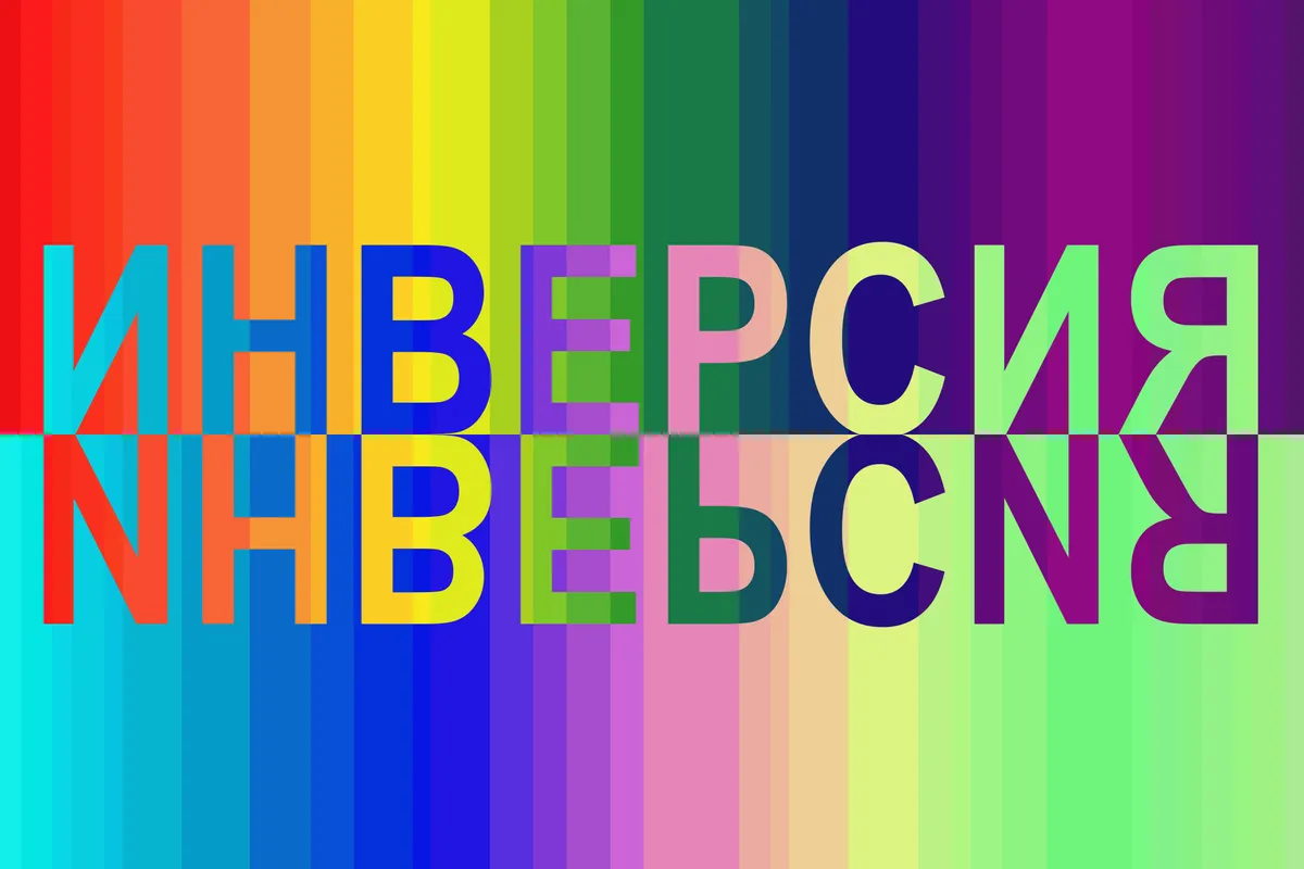
Here is a test you can run on any brand, including your own. Cover the logo on the homepage, an Instagram post, a proposal PDF, and an invoice. Can you still tell all four came from the same company? If the answer is no, you do not have a visual identity — you have a logo and a collection of unrelated design decisions made under deadline pressure.
This matters more than most owners think, because the logo is the element your audience sees least. It occupies a corner of the website, a few square centimetres of a business card, a favicon. What people actually experience, over and over, is everything around it: the colours of your buttons and backgrounds, the typeface in your headlines, the way your photos are lit, the style of the little icons next to your service descriptions, the amount of breathing room on the page. Those elements do the recognition work. Strip the wordmark off a well-built identity and people still know whose ad they are looking at — that is the entire point.
A visual identity, properly understood, is a system: a constrained set of colours, type, imagery, iconography, and spatial rules, plus the logic for combining them, that any designer — or non-designer with a template — can apply and get a result that looks like it belongs. The logo is one component of that system, and honestly one of the easier ones. The rest of this article walks through the components that actually carry the load, in roughly the order we build them.
Building a Color System, Not a Color Palette
Most small-business brand documents contain a row of five pretty swatches and no instructions. That is a palette, and palettes fail on contact with reality, because real design work asks questions a row of swatches cannot answer. Which colour is a button? Which is a background? What colour is body text on the dark version? What do error states look like? When every designer answers those questions differently, the brand drifts one decision at a time.
A colour system answers the questions in advance by assigning roles. You need a dominant brand colour — the one people will name when they describe you — and a clear rule for where it appears. You need a working set of neutrals: the near-white backgrounds, the greys for borders and secondary text, the near-black for headlines, usually several steps of each, because interfaces and documents are mostly neutral with the brand colour deployed deliberately. You need an accent for moments that must pull the eye, used sparingly enough that it still works. And you need functional colours for success, warning, and error states that read correctly without clashing with the brand set.
Two constraints separate professional colour systems from amateur ones. First, accessibility: every text-and-background pairing you sanction should meet WCAG contrast ratios, checked and recorded, because a brand colour that fails contrast will be quietly swapped out by every conscientious developer who touches it — and inconsistently. Second, proportion: specify roughly how much of each colour a composition should carry. A brand whose blue covers sixty percent of every surface and a brand that uses the same blue only on calls to action are two different visual identities wearing the same swatches.
Typography: The Voice People See Before They Read
Type is the most underrated identity element, which is strange, because it touches more surface area than anything else. Nearly everything a brand publishes is words, and every word arrives dressed in a typeface. Before anyone reads your headline, the letterforms have already said something — sturdy or delicate, traditional or modern, warm or clinical. If that impression contradicts your positioning, you are paying for the contradiction on every page.
A workable typography system needs surprisingly few decisions, made firmly. Choose a display face for headlines that carries personality, and a text face for body copy that disappears politely at small sizes — sometimes one family does both, but the pairing of a characterful display face with a quiet workhorse is popular because it works. Confirm licensing covers web, desktop, and any app or video use before you fall in love; retrofitting a font licence is an unpleasant conversation. And check language support if you serve a multilingual market, which in Toronto and Vancouver you very likely do.
Then build the scale: a fixed ladder of sizes with assigned jobs — page title, section heading, card heading, body, caption — along with weights, line heights, and letter spacing for each. The scale is what makes typography systematic rather than decorative. When every document and page picks from the same five or six steps, materials produced by different people in different months still rhyme. When designers invent a new size every time something feels slightly off, you get the typographic equivalent of a junk drawer. The hierarchy should be obvious at a squint: blur your eyes at the page, and you should still be able to tell what matters most.
Imagery Style: Art Direction You Can Repeat
Photography and imagery are where brand consistency goes to die. Colour and type can be locked down in files and templates, but images are chosen fresh every week — by whoever is posting, from whatever stock library or camera roll is at hand — and without rules, six months of choices will produce a feed that looks like six different companies.
The fix is written art direction: a short set of decisions about what your images are, not just examples of ones you liked. Decide the subject philosophy — real staff and real job sites, or styled studio work, or abstract and illustrative. Decide the light and colour temperature: bright and airy, or moody and contrast-heavy, warm or cool. Decide the human element: are there always people, never people, hands at work? Decide the angle and distance you favour — intimate close-ups, wide environmental shots — and the post-processing recipe, ideally as an actual preset so every photo passes through the same grade. Equally useful is the negative list: no generic handshake stock, no watermarked anything, no clip-art metaphors of lightbulbs and target boards.
For businesses on a budget, this is also the honest case for one well-planned brand shoot over a stock subscription. A single day of photography, shot deliberately against the art direction with a generous shot list, produces a library that is consistent by construction and unmistakably yours. Stock can fill gaps, but it should be selected to match the written direction and graded with the same preset — chosen to look like your photos, not theirs.
Iconography and Illustration: The Small Details That Compound
Icons feel like a trivial detail right up until you see a pricing page where the checkmarks are three different weights, the feature icons came from two different free libraries, and one of them is mysteriously a different blue. No single icon ruins anything; the accumulation reads as carelessness, and visitors absorb it without being able to articulate why the page feels off.
An iconography standard takes an afternoon to define and saves years of drift. Pick one construction style — outlined or filled, and if outlined, a single stroke weight. Fix the corner treatment, rounded or sharp, to match the geometry of your logo and type. Fix the grid size icons are drawn on so they sit at consistent visual weight next to each other. Fix the colour rules: icons in a neutral, in the brand colour, or in a tinted container, but one convention, applied everywhere. Then choose a single source — one library, or a commissioned set — and forbid one-off imports. If a needed icon does not exist in your set, the answer is to draw or commission it in the house style, not to grab the nearest approximation from a different family.
Illustration, if you use it, deserves the same treatment at a larger scale: a defined line quality, a fixed sub-palette drawn from the colour system, a consistent level of abstraction. Illustration is a bigger commitment than iconography because it is harder to fake continuity — a brand should either invest in a repeatable illustration style or stay out of illustration entirely. A website with one lovely bespoke illustration and five mismatched freebies is worse than a website with none.
Layout, Spacing, and the Discipline of White Space
The least visible component of a visual identity is the space between things, and it is frequently the real difference between materials that look expensive and materials that look homemade. Two designs can use identical colours, type, and photos, and the one with generous, consistent spacing will read as the more credible company every time.
The systematic version of this instinct is a spacing scale: a small set of approved gaps — built on a consistent base unit — used for everything from the padding inside a button to the gulf between page sections. Like the type scale, its power is in what it forbids. When every margin is picked from the same short ladder, layouts produced by different hands share a rhythm; when spacing is eyeballed fresh each time, nothing quite aligns and nobody can say why. Alongside the scale sit a few structural rules: the grid that columns snap to, the corner radius used on cards and buttons (one radius, maybe two — not a different curve per component), and the shadow treatment, defined once and reused.
White space deserves explicit defence in your standards because it is always the first casualty. Someone will want the hero section tighter so more content fits above the fold; someone will want a third column squeezed in. Density is a brand decision, not a per-page negotiation. A brand that breathes communicates confidence — it implies you do not need to shout everything at once. Write the minimums down so the intern building next quarter’s sales deck inherits the confidence along with the colour codes.
Design Tokens: Turning Identity Decisions Into a Single Source of Truth
Everything above produces decisions. Design tokens are how those decisions stop living in a PDF and start living in the actual tools where work happens. A token is simply a named value: a colour stops being a hex code pasted from memory and becomes a named variable like brand primary or surface background; a font size becomes heading large; a gap becomes spacing medium. The names carry the role, and the values live in exactly one place.
The practical payoff is twofold. First, consistency by default: when the website’s stylesheet, the design files, and the document templates all reference the same named tokens, nobody is transcribing hex codes by hand, which means nobody is mistranscribing them. The subtle wrong-blue problem — where the brand colour exists in four slightly different versions across the site, the deck, and the social templates — simply cannot occur, because there is one definition. Second, change becomes cheap: when the brand evolves, you update the token values once and everything that references them follows. A refresh that would otherwise mean hunting through hundreds of files becomes an afternoon.
For a small business, tokens do not require enterprise tooling. Variables in your design tool, custom properties in your site’s CSS, and theme colours configured properly in your slide and document templates — all drawing from one canonical definition file — already deliver most of the value. The principle scales down gracefully: name the decision once, reference the name everywhere, and never let a raw value sneak past the system. If your developer and your designer can both point to the same definition of brand primary, you have design tokens, whatever you call them.
Cohesion Across Touchpoints: Where Identities Survive or Fall Apart
A visual identity is not finished when the system is designed; it is finished when it survives contact with everyone who will ever produce something in its name. The website usually stays on-brand because a professional built it. The danger zone is everywhere else: the sales deck assembled the night before a pitch, the job posting, the trade-show banner ordered in a rush, the email signature each employee improvises, the invoice template nobody has looked at since the accounting software was set up. Customers do not experience your touchpoints in order of how much design attention each one received — the sloppy invoice and the polished homepage carry equal evidentiary weight about who you are.
The defence is templates, not vigilance. For every recurring artifact — social posts, decks, one-pagers, proposals, email signatures, ad sizes — build a locked template that has the identity baked in, so the path of least resistance produces an on-brand result. People do not follow guidelines under deadline; they grab whatever is closest. Make the closest thing correct. Pair the templates with a tidy asset library — logos in every required format, the photo library, the icon set, the token definitions — in one shared location, so nobody screenshots the logo off the website again.
Then audit twice a year: gather one specimen of everything currently in circulation, lay it all out on one screen or table, and look for the drift. Done this way, the cover-the-logo test from the start of this article stops being a gotcha and becomes a routine health check.
One honest closing note on scope. A full visual identity system is a bigger engagement than a logo, and it should be — you are buying years of decisions made once, correctly, instead of remade badly every week. At SearchPod we treat identity work as infrastructure for performance: ads convert better when the landing page looks like the ad, and both convert better when they look like a company that has its act together. The logo gets the attention. The system gets the results.
Want help implementing this?
Get a free proposal for your branding setup. We’ll show you exactly where the opportunities are.
Get Free ProposalRelated Articles